FINANSEER INFOGRAPHIC
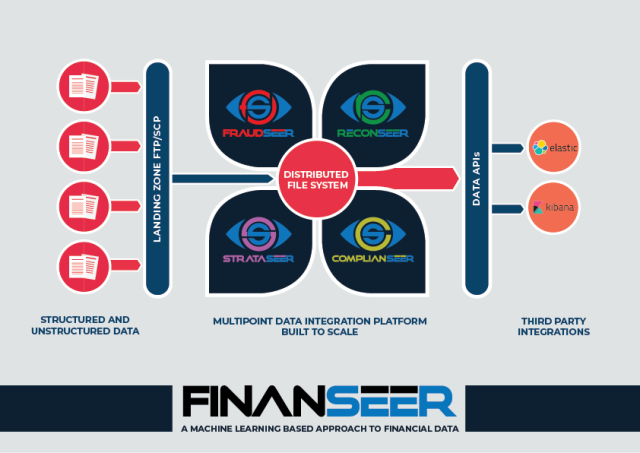
Created a visually interesting infographic poster for an Atlanta-based technology company, DataSeers. Their platform is capable of handling large amounts of varying data that the financial services industry sees on a daily basis; this includes data from switches, networks, data warehouses and even core banking infrastructure.

The Challenge
To create an impressive poster, for FinanSeer. It should be about the process itself -a platform that provides a single system for Automated Reconciliation, Fraud Detection, Compliance Oversight and Data Analytics.
The Solution
Research about DataSeers’ platform called FinanSeer and figure out how to present a vast amount of information in a poster, keep it simple, interesting and at the same time useful to understand the process. All elements delivered as separate SVG to be used in presentations and future animations.
Sketches
This page showcases a selection of my Infographic Designs. Some of these designs are unused concepts from commissioned projects, and some are conceptual designs created for the purpose of selling. Do not copy the design ideas or sketches, to use as is or modified in any form. All rights reserved by the designer – Shubhangi Bhosale.
Options Presented
This page showcases a selection of my Infographic Designs. Some of these designs are unused concepts from commissioned projects, and some are conceptual designs created for the purpose of selling. Do not copy the design ideas or sketches, to use as is or modified in any form. All rights reserved by the designer – Shubhangi Bhosale.
Reflection and Solution
Below is the iteration based on client feedback.
1: Clear logo with a brief and precise tagline.
2: This label placed vertical, keeping in mind that this infographic will also be in portrait layout.
3: Various kind of data depicted by using several different colors.
4: Corresponding bead shapes, to show the direction of flow and to be used in animations.
5: Thicker and bold connecting lines.
6: ‘Distributed File System’ made the focal point by using filled in circle with darker colors.
7: Corresponding bead shapes, to show the direction of flow from Distributed File System to all four Seers. Each bead is given the color of respective Seer identity.
8: Thicker outline of the arc depicting a glass pane.
9: Dashboards of actual third-party applications.
Impact
- Improved engagement and web traffic by a large margin of 78%.
- 100% successful in reaching the goal of being informational, engaging and helpful in business promotion.
Interested in working together?


