Overview
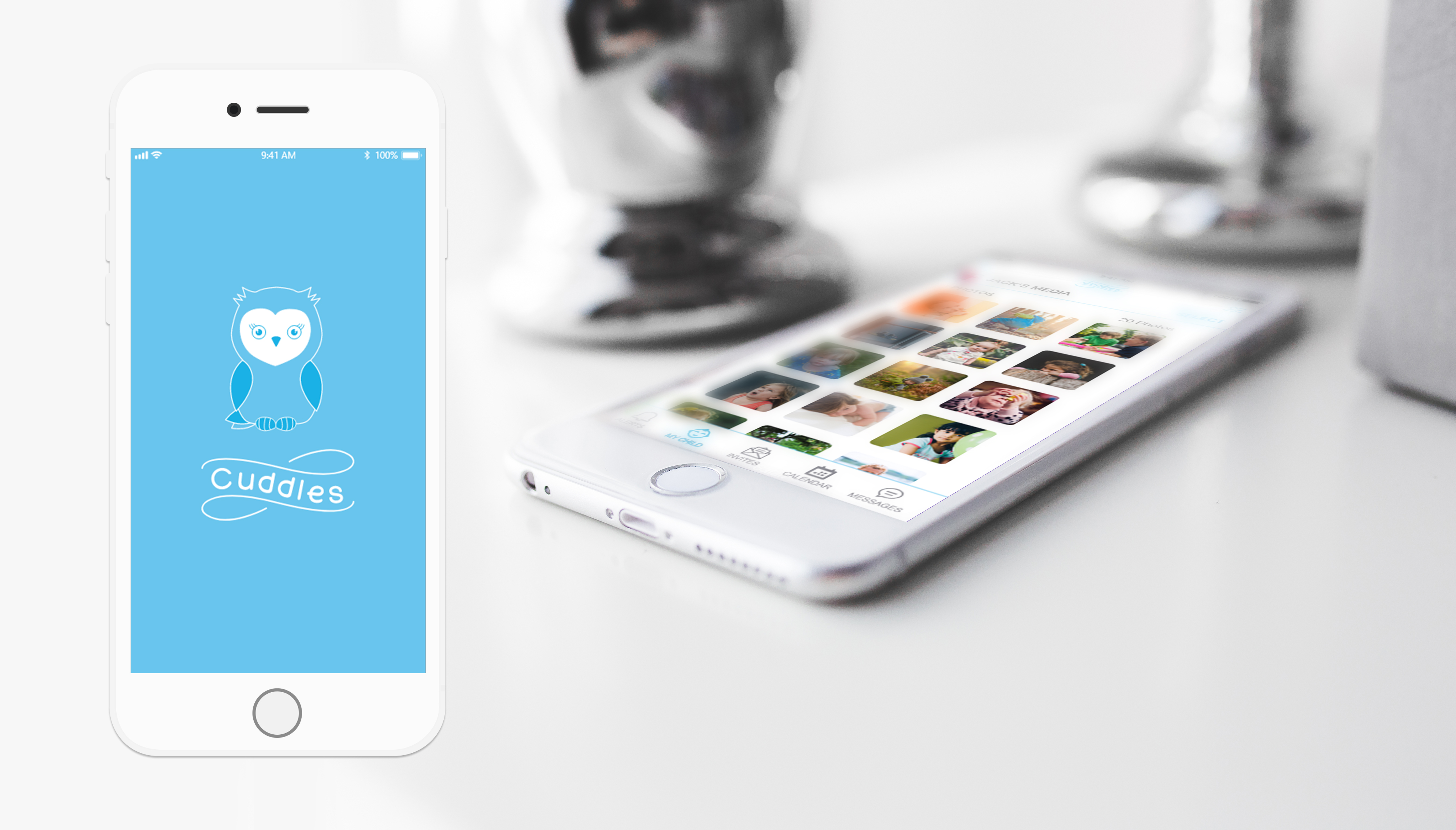
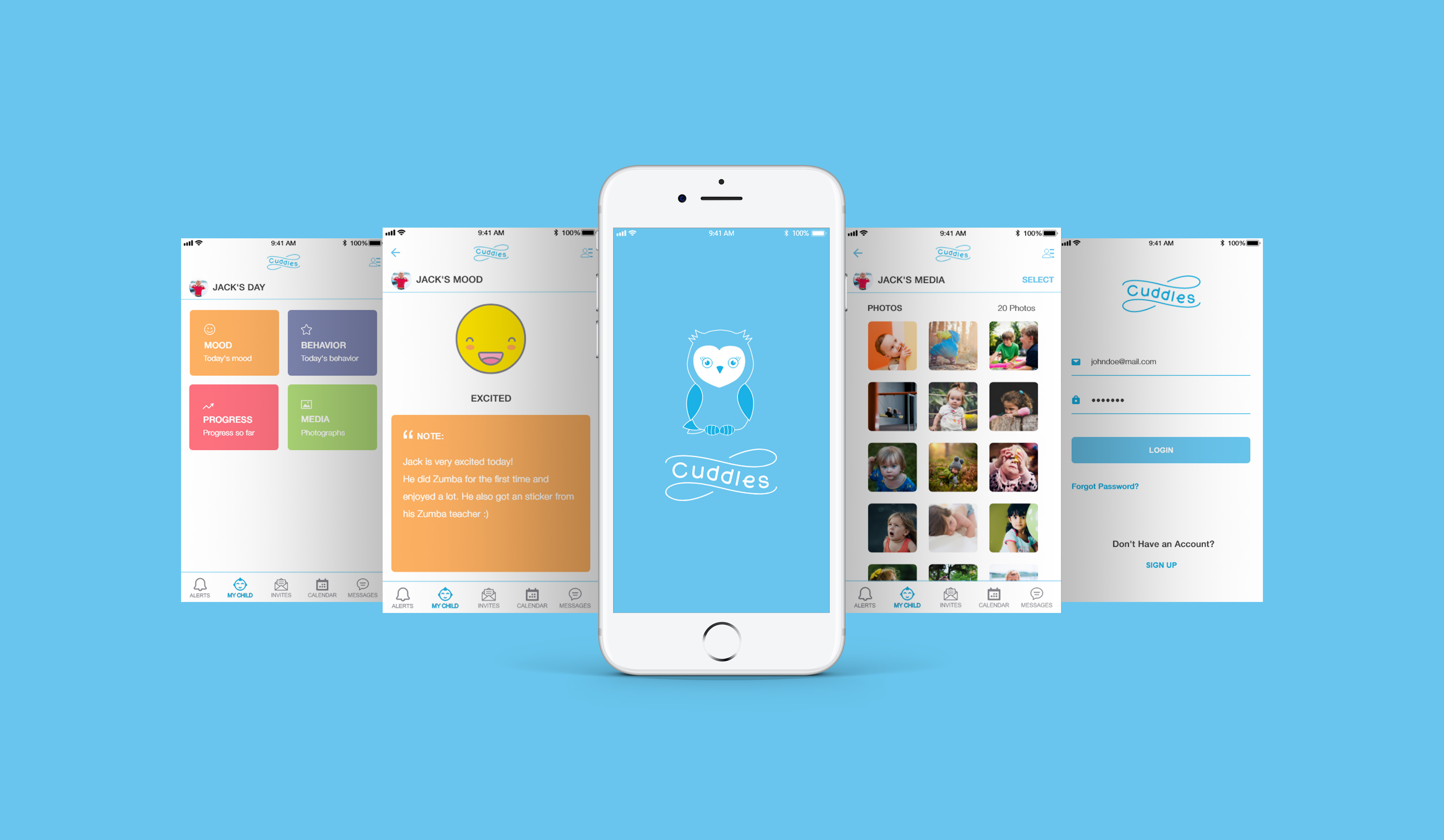
Cuddles is an iOS UX/UI design project for Springboard. The assignment was to use all the design skills and tools we learned, to design a daycare mobile application that parents can use. I did user research, developed userflows, sitemaps, logo and style guide using Adobe Illustrator, wireframes and high-fidelity clickable prototype using Adobe XD and InVision.
The Challenge
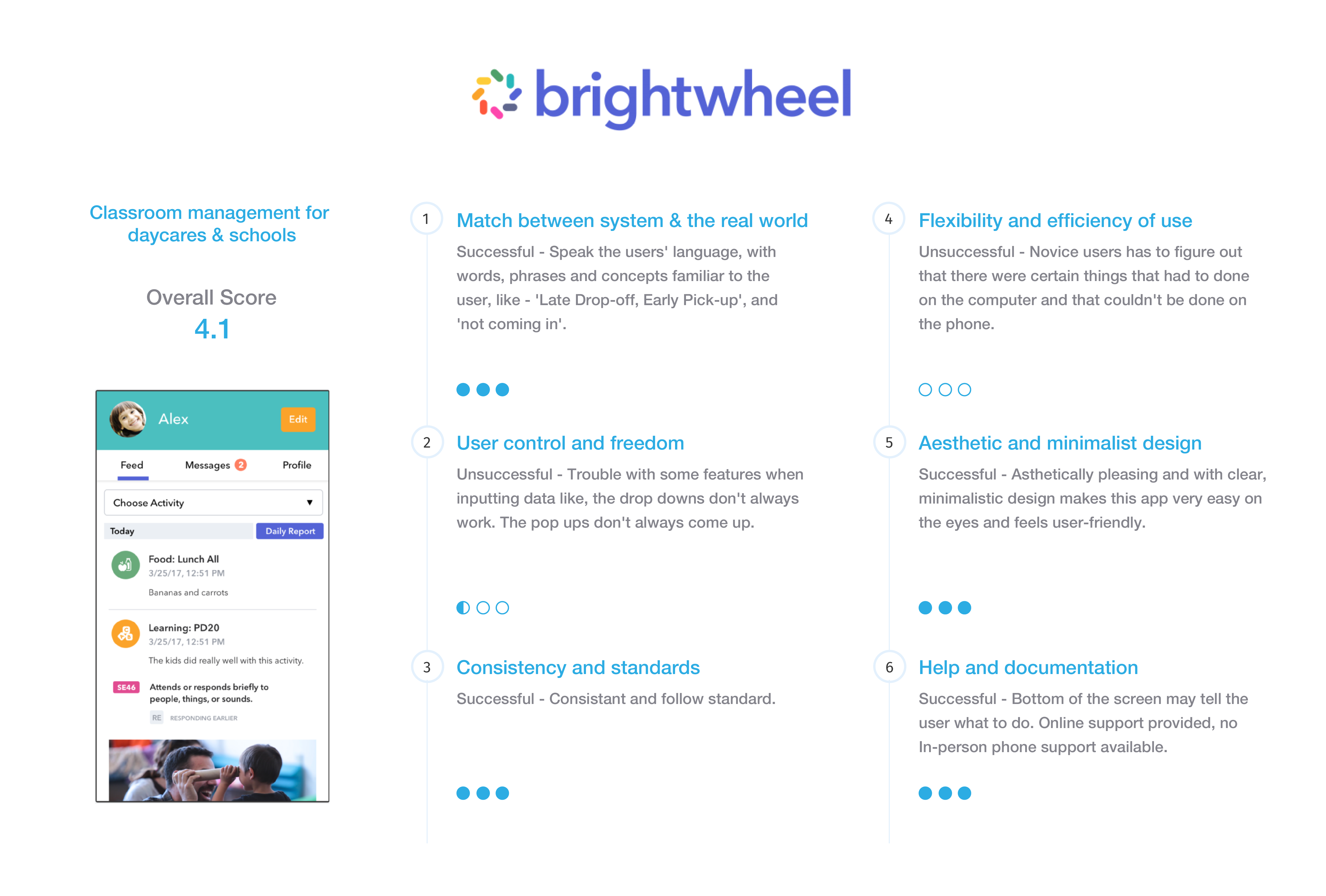
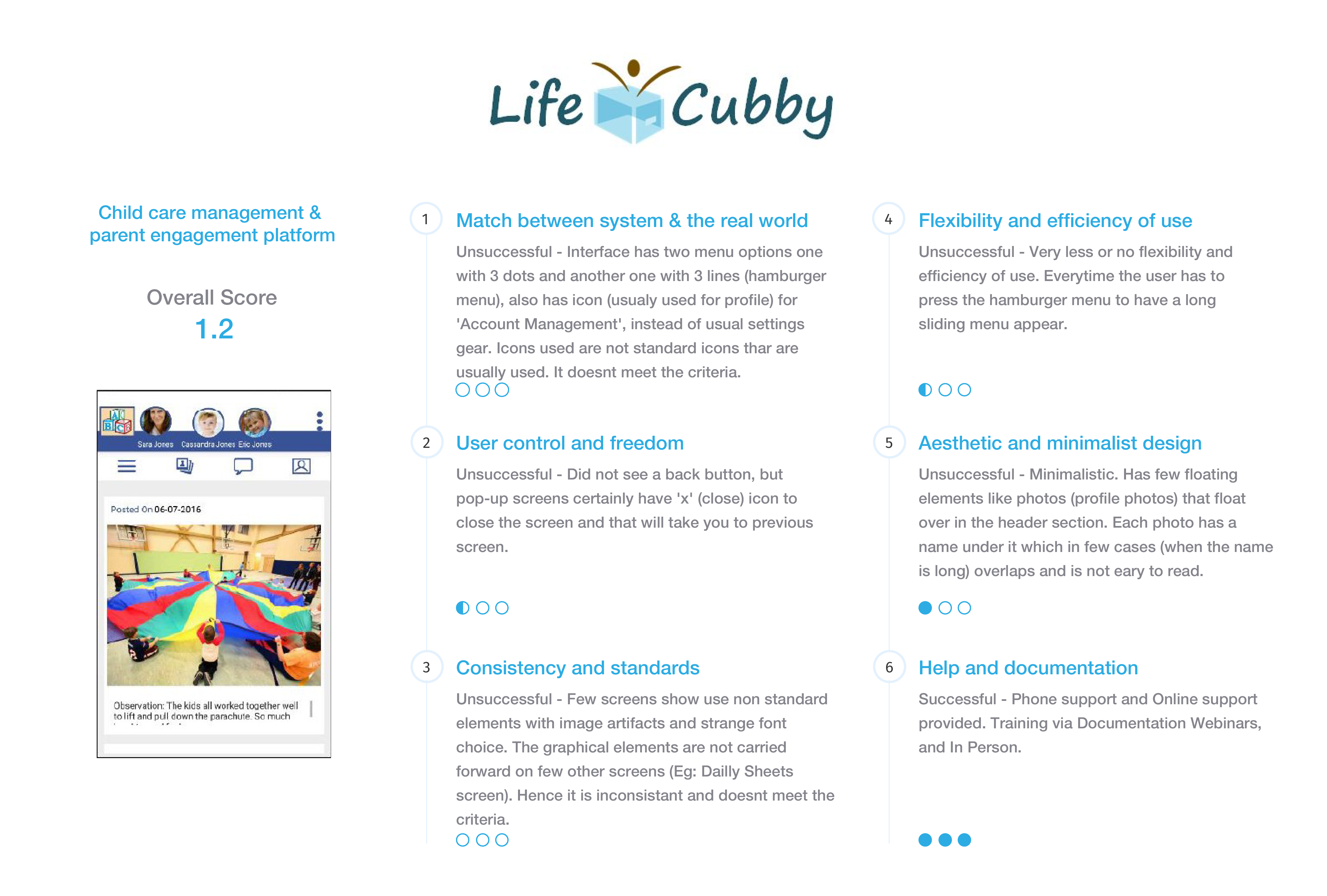
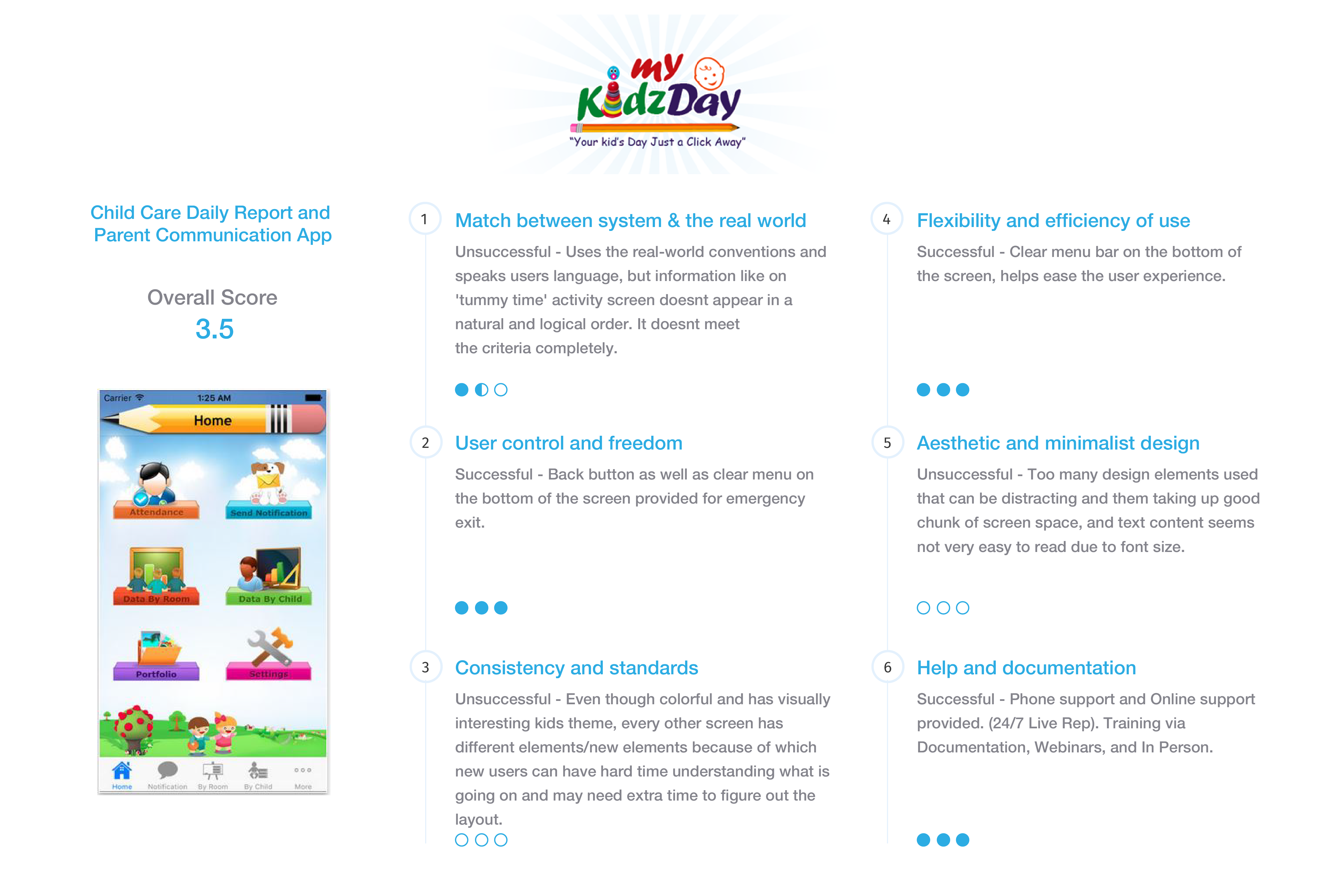
Every parent has to choose and take loads of decisions while raising a child. The environment in which their child will learn and grow, their child’s care and early education are just a few of the most important decisions that parents/guardians will make for the child. Parents do not know how the child is doing at the daycare/preschool, and have to wait until they pick up the child. Few apps are currently in the market that primarily focuses either on daycare and preschool kid activities or used as an administrative tool. Apart from a few existing features, there is a vital need to redesign and add a few more features that would help to make a parents/guardians focused app.
The Solution
This new app would be a complete parent-focused app, that would keep the parents/guardians updated with their child’s wellbeing and activities while in daycare/preschool. Parents/guardians would get:
- Real-time feed of activities throughout the day.
- Notifications on their phone for emergency alerts (pick-up alert, incidents, sick child), photos, and messaging.
- Updates on the activities, payment schedules+alerts, upcoming events.
- Direct staff /caregiver messaging facility to notify specifics about the child day.

User Research
Conducted online survey and in-person interviews of parents regarding their experiences with sending their kids to daycare/preschool – particularly on their real worries, frustrations, and their similar app usage (if any) and interactions with caregivers. Discovered issues which had not been thought of before, that influenced the final app prototype; knowing the parents most crucial worry is essential, especially when being away from their little ones for hours.
%
Parents are worried about the child's well-being while at daycare.
%
Parents want to stay informed about their child's development.
%
Parents would like to have specific notes, and parenting tips shared in the weekly newsletters.
%
Parents wants to know the schedule ahead of time.
Feedback from Interview
- Parents don’t get to see a picture of the child doing a particular activity mentioned in the newsletter.
- Parents forget to get the paper copy of the menu.
- Parents with multiple kids think that the daily sheet is a hassle to: carry, look at and make sense.
- Parents of younger kids don’t think meetings are necessary unless there is a need to discuss a specific behavioral concern.
- Parents sometimes forget to buy supplies, pay fees on time, dress kids according to the event.
Many things came up during the conversation in regards to what parents would like to see:
- Parenting tips once a week as per age groups – ex: How to know when it’s time to start potty training. Sensory activities you can do at home.
- Update about the substitute teacher, teacher changing, and kid moving into another class for that day due to a change in teacher-child ratio.
- For parents of younger kids, alerts for restocking – diapers, wipes, spare clothes, etc.
- Reminders about picture day, payment due, if signed up to bring anything to the class party.
- An electronic copy of the menu so that the parents can plan meals at home – don’t want to make something for dinner that they already had for lunch.
Persona and Empathy Maps
Based on the interviews and survey created personas and empathy maps to gain a better understanding of daycare app users. These helped to keep the project focused on the real users and their needs as parents. Click on the image to view a larger image.
Scenario Map
Basing the map on both primary users and the essential tasks they would undertake. For each step, I captured the following: what the user does, any comments, any questions or assumptions, and any ideas or useful suggestions. Click on the image to view a larger image.
Storyboard
Took the scenario text and created a visualization of each scene, showing how the users interact with the app and with their surroundings. I found an almost one-to-one relationship between the sticky notes from scenario maps and the panels in my storyboard, and at times storyboard visuals covered several scenario steps. You can click on the image to view a larger image.

Content Strategy
Card Sort
After the basic needs of the app were determined, the next step was to create a flow that the user could understand and navigate. In a card sorting activity, using OptimalSort, potential users were asked to organize the user stories into categories which made the most sense to them. Click on the image to view a larger image.
Card Sort – Summary and Findings
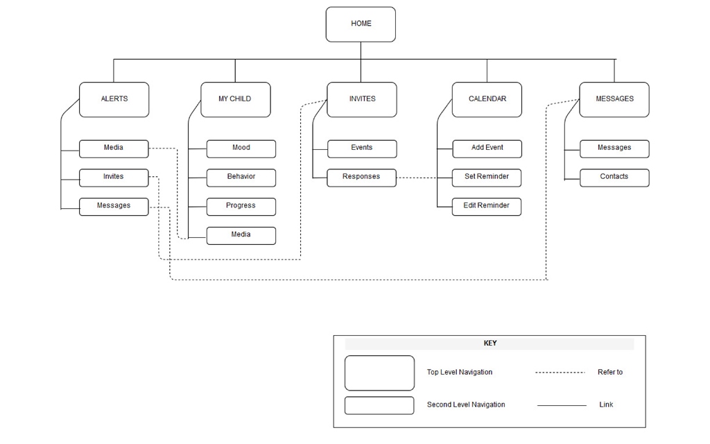
I launched the Card Sort study through OptimalSort online tool – 6 people have participated and sorted all 23 cards into an average of 5 groups, were average time taken to sort all cards was around 12 minutes. It was interesting to see how the participants classified the same tasks into different categories. For example – a few categorized creating an account, log-in, sign-out and viewing app features in one, while a couple of them grouped them into two categories namely; Log-in and Features. For some participants specific tasks were not as easy to categorize; hence they surprisingly used ‘Updates’ category for both the messages as well for information about the child. Also, noticed that some terms were used interchangeably. For example – categorized checking a child’s mood, behavior, progress, and photos as ‘My Child,’ ‘My Kid,’ ‘Child Info,’ ‘About Child.’ Keeping all the feedback in mind, I created a sitemap that will hopefully allow the user to navigate the app quickly.
Site Map
The following sitemap was developed using the insight gained from the previous card sorting activity.
User Flows
Working with the personas and being empathetic to their needs, user flows were created to understand how they would individually work through the app to meet their requirements. The user flows were sketched out, refined graphically, and then iterated after receiving feedback. Click on the image to view a larger image.

Design & Identity
Sketches
Quickly sketching out app frames and features, allowed for numerous iterations and refinement in the initial design of the app, based on my initial research. Click on any of the below images to open the gallery of larger images.
Wireframes
This graphical wireframing stage allowed for more refinement as ‘feature creep’ was identified and removed. Click on any of the below images to open the gallery of larger images.
Wireframes – Findings
I want to say that I thoroughly enjoyed this phase in the project – as it took me one step closer to practically visualizing the layout and the working of the app. The actual process of sketching each screen of the user flows was a little time consuming, but fairly easy. As user flows gave me a clear idea and I could visualize how the features would look and function. One might not see the importance of simple pen to paper sketching, but I am a very big supporter of it, will tell you why – only after I started the sketches, I realized that there has to be several ‘in-between’ screens, that are needed in order for the user to complete his/her task successfully. This certainly helps save time, efforts and resources in the long run. It was very helpful to spend a longer amount of time on the sketching phase before starting the wireframing process using Adobe XD. During the process of wireframing, there was a lot of back and forth editing after each review by my mentor. Very helpful feedback with useful suggestions were given, that helped me improve the wireframes:
- A message (pop-up or a new screen) to show the outcome (successful or not) so that the user is aware of what’s happening.
- Clear indicators of which ones are text fields that are supposed to be filled in by the user and which ones are not.
- Replacing ‘Settings’ icon by ‘User Menu’ as it was more clear and appropriate for this project.
- Using known icons with text labels to reduce confusion and for better understanding.
- Removal of ‘Likes’ and ‘Comments’ from the ‘Alerts’ screen as this screen does not facilitate user to like or comment, but just provides him/her with the list of alerts (notifications).
Style Guide
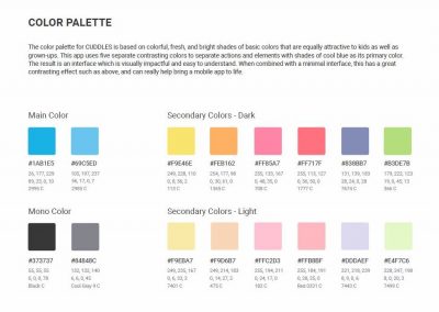
The style guide was then created as a resource for designers, product managers, and developers, providing a common language around app’s UI patterns. It will be used to maintain modular front-end code and visual consistency across the app. Click on the image to enlarge it.
Prototype
It’s time to transform the static wireframes into an interactive prototype, bringing it to life! The details of the wireframes allowed easy manipulation and quick understanding of how the interactions would be conceptualized. I used Adobe XD and InVision to create an interactive prototype. This process allowed me to:
- View and evaluate interactions that couldn’t be shown in static wireframes.
- Iterate and correct any functionality issues that weren’t apparent during wireframing.
- Create a clickable platform for future usability testing.
Click on any of the below images to open the gallery of larger images.
Usability Testing
Next step was taken to find out whether the design works. Usability tests were conducted in-person, and online, including a set of directed tasks for the participants to complete using the prototype.
Task 1
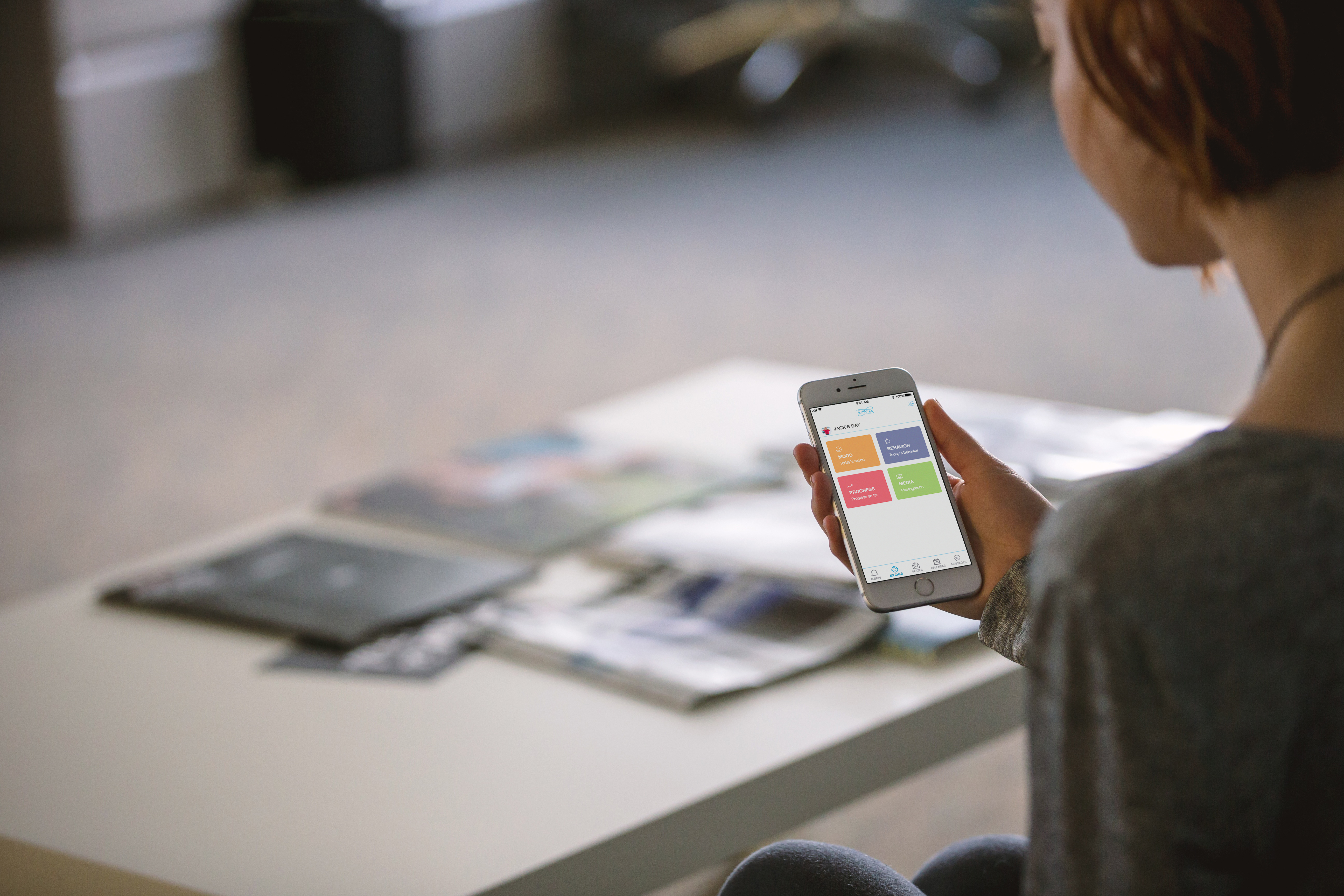
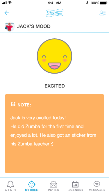
Participants were asked to check the mood of their child, using the app.
Observations:
- For all the participants this was the quickest task and it took them 2 steps to complete it.
- They all mentioned: good colors, user-friendly and fun interactivity.
Suggested Changes:
- 1 participant suggested having a picture of the child along with the ‘Note’ from the teacher on this screen.
- 1 participant suggested that parents should be able to interact with the teacher about the ‘Note’.
Task 2
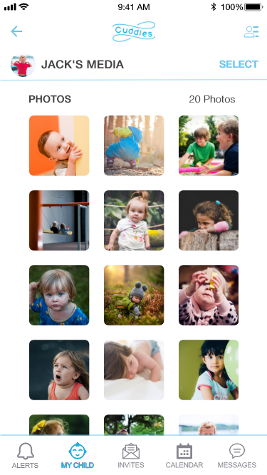
Participants were asked to download or email the photographs of their child, using the app.
Observations:
- 1 participant had trouble finding where to go, to find the photographs, said word ‘MEDIA’ confused her.
- 3 participants tried tapping on the photograph directly, instead of tapping on blue ‘SELECT’ link on the top right corner of the screen, first.
- Rest of the participants found the task very easy and could achieve their goal in few steps.
Suggested Changes:
- 1 participant suggested changing ‘MEDIA’ word to ‘PHOTOGRAPHS’ or ‘PHOTOS’.
- 3 participants suggested having a pop-up to tell users to click on ‘SELECT’ to start selecting photos.
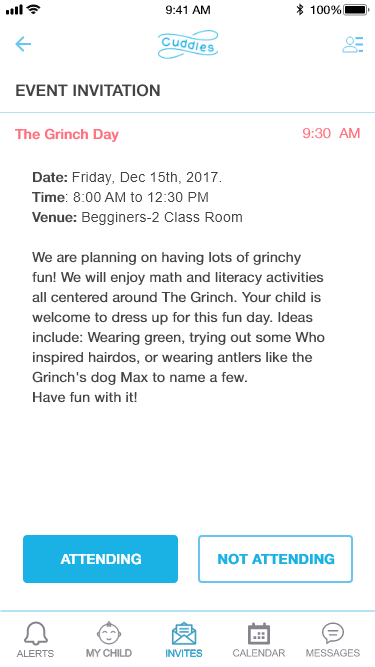
Task 3
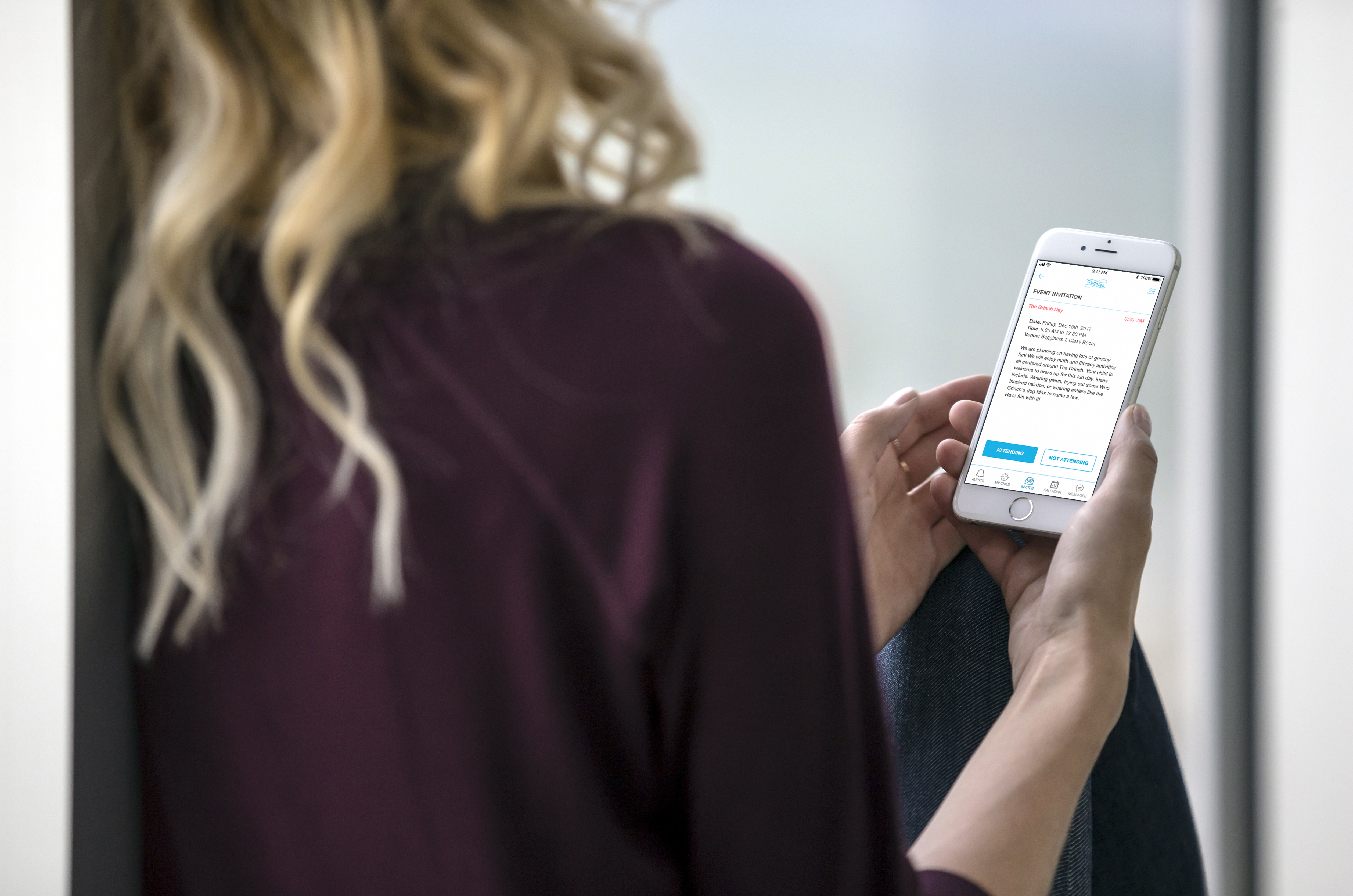
Participants were asked to respond to an event invitation, using the app.
Observations:
- All participants could complete the task quickly and easily, without any confusion or hesitation.
Suggested Changes:
- 1 participant suggested rearranging the response buttons; placing ‘ATTENDING’ on the right-hand side and ‘NOT ATTENDING’ on the left-hand side. This change must follow throughout the app.
- 1 participant suggested that maybe in future, provide an ‘Advanced’ Mode where a user can set his/her preferences depending on whether they are left handed or right handed.
